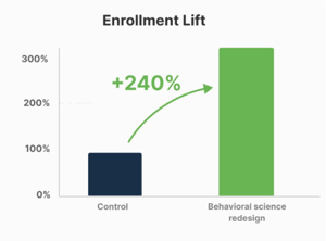
IN BRIEF: We identified the behavioral barriers keeping members from enrolling in a fully covered heart health program and redesigned the experience to increase enrollment by 240%.
Health plans and corporate wellness programs partner with digital health companies, care management organizations, and other specialized vendors to help close care gaps and improve member outcomes. These offerings are typically delivered as member-facing programs. However, these types of programs only create impact when members engage with them. Even when a program offers meaningful benefits to the member, they still must choose to use it.
This creates a behavioral challenge across these types of programs. Just because the benefit is available doesn't mean members will use it. Like most consumers, members are weighing whether something is relevant to them, whether they can trust it, how much effort it'll take, and what they need to do to get started. If members don't immediately see the value for themselves, simply making a benefit available isn't enough to drive action.
This was the challenge facing a leading digital heart health company whose program was designed to help eligible members manage their blood pressure. The program offered a connected blood pressure monitor, heart health tracking, personalized guidance, and doctor-ready reports, all fully covered. Yet enrollment remained low with members opting out of this particular program.
The benefit was there. The challenge was getting members to act on it.
Limetree was brought in to understand what was getting in the way and apply behavioral science to close the gap.
To understand why enrollment was lagging, Limetree first looked at the member experience from end to end. We audited the existing communications alongside program information, audience data, and previous campaign learnings to understand where members might be experiencing friction.
The first instance behavioral barriers showed up was in how the program was being communicated to members. The existing direct-mail communications contained the right level of information, but they weren't necessarily making the decision to enroll feel simple, relevant, or worthwhile. Three barriers stood out:
These findings gave us a behavioral diagnosis and pointed to a specific set of opportunities to test how we could influence member behavior to ultimately increase enrollment.
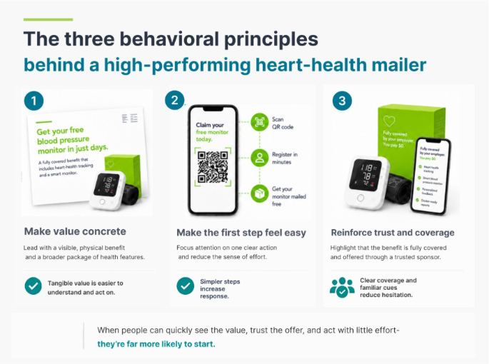
The final creative brought several behaviorally informed changes together in a single in-market test.
Make the reward immediate. Opening the communication with, “Get your free blood pressure monitor in just days” gave members a clear, tangible benefit to look forward to, rather than asking them to think about the longer-term value of heart health monitoring. The monitor, cuff, app, and packaging became the visual centerpiece, making the offer easier to see, understand, and anticipate.
Make the value easy to scan. Adding a simple checklist highlighted the full benefit, heart health tracking, a connected monitor, personalized coaching, doctor-ready reports, and tools for tracking fitness, medications, and cholesterol. This gave members a quick way to understand everything included in the program without having to read through the full communication or piece together the value themselves.
Remove uncertainty. Full coverage was made highly visible, reinforcing that this was an existing benefit, not something members needed to purchase or question. Making the coverage clear upfront helped address a key source of hesitation and made the offer feel more credible and accessible.
Make the first action smaller. The messaging was reframed around a simple next step, “Claim your free monitor today.” Rather than asking members to think through the entire enrollment journey, the communication focused attention on one clear next step. Members could also scan a QR code or use the text option to get started, without needing to understand the entire enrollment process upfront.
Before this creative went to the full population, Limetree developed multiple concepts for how the program could be framed and communicated, and rapidly pre-tested them with a targeted audience. We tested questions like whether a “Welcome Kit” would make the benefit feel more tangible, whether showing the product would outperform lifestyle imagery, whether emphasizing the technology would increase or decrease interest, and whether different audiences would respond differently to the same framing.
Testing challenged some of our initial assumptions. We found that focusing on the technology itself was less effective than focusing on the health benefits, ease, and tangible value the program could provide. That insight is what shaped the creative on this page, not the other way around.
Once the redesigned creative was ready, Limetree and the digital heart health company measured it the same way, deliberately. The test ran as a large-scale field experiment, the redesigned communications against the existing approach, spanning 50,351 mailers across 17 client populations, built to isolate what the redesign itself was responsible for.
The redesigned campaign was tested against the original creative in a large-scale field experiment. Members who received the redesigned mailer enrolled in the program significantly more than those who received the original. The strongest response came from higher-risk populations, members who weren't yet managing their blood pressure well.
A benefit program only pays off when the members who need it most are the ones enrolling, and this redesign delivered exactly that population, not just more enrollment. The same principle extends beyond quality into care management and risk adjustment, wherever a plan's ability to improve member health outcomes depends on reaching the members who need it most, not just the ones who respond easily.
For health plans, the lesson extends far beyond heart health. A health-based vendor can deliver the right solution, but the health plan still needs members to take action. Behavioral science can help identify what is getting in the way and turn those insights into communications that make the value clearer, reduce friction, and make the next step easier.

Every concept we pre-tested, the message that won, and how a follow-up campaign performed.